Infographics
This page highlights our current infographics. All infographics can be downloaded as a PDF and used with appropriate attribution.
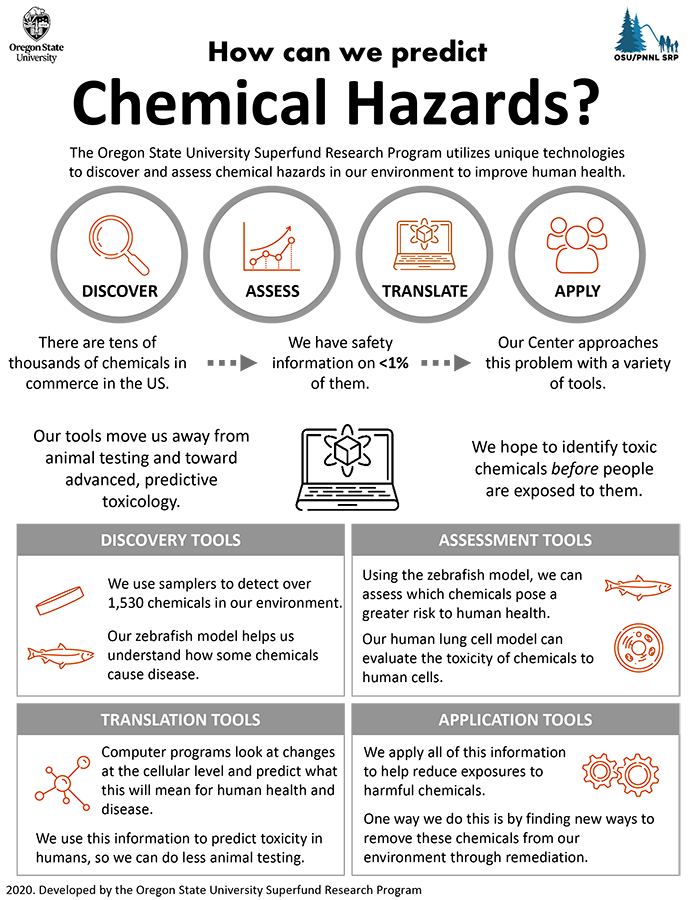
Infographic describing how the OSU Superfund Research Center utilizes unique technologies to discover and assess chemical hazards in our environment to improve human health.
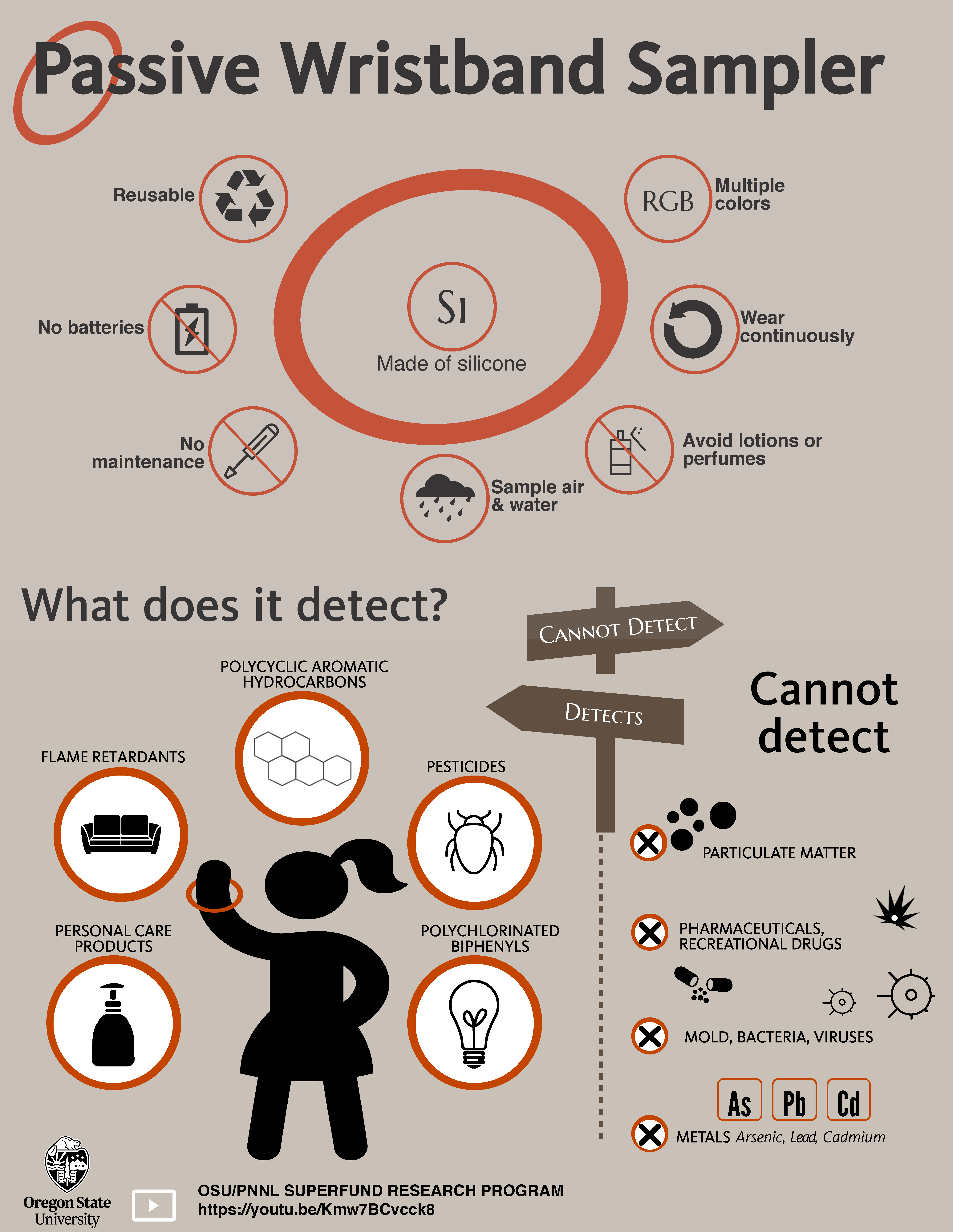
Infographic about the silicone wristband passive sampler, what it detects, and what it cannot detect.
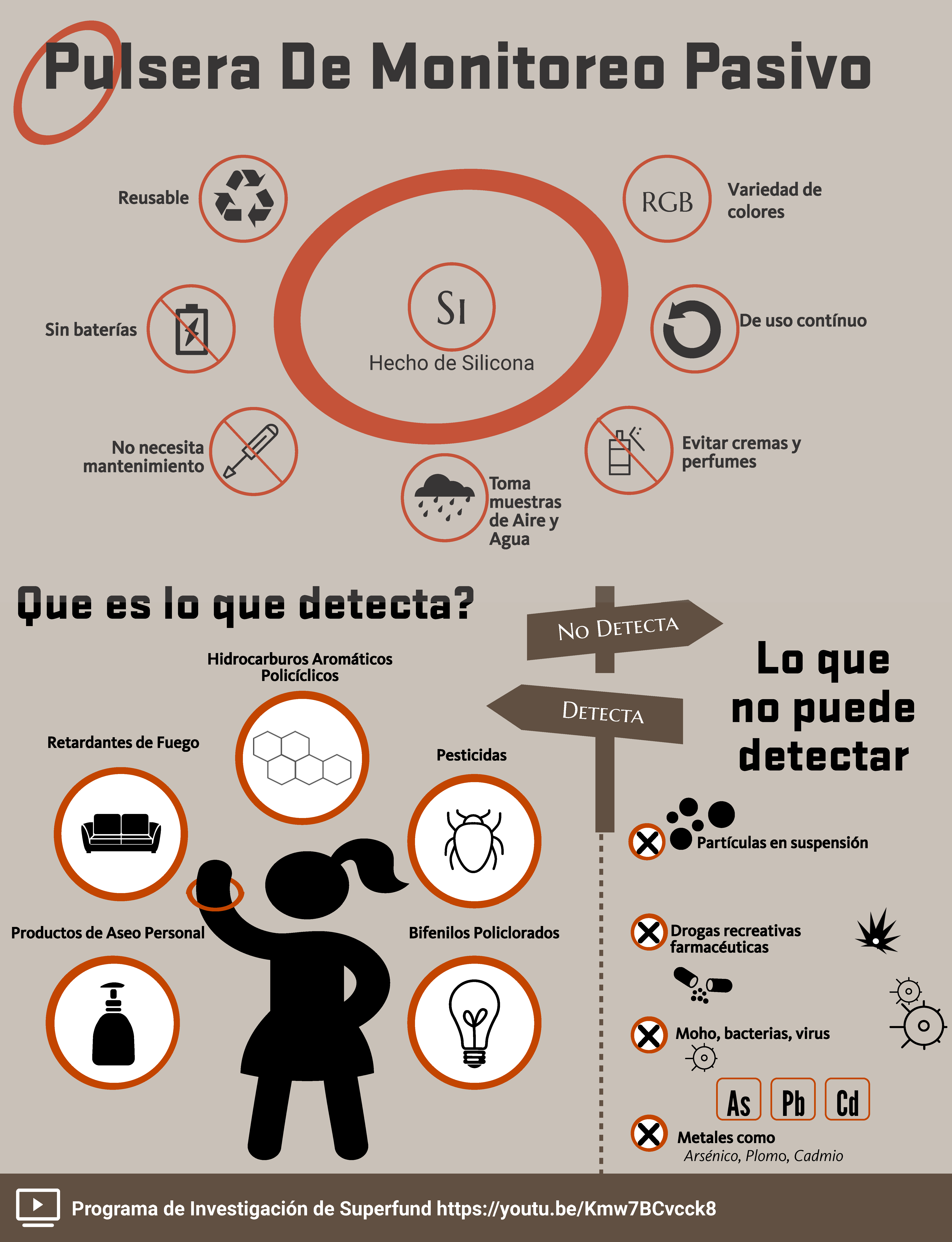
Infografía sobre el muestreador pasivo de pulsera de silicona, qué detecta y qué no puede detectar.
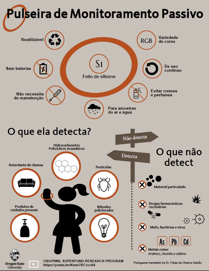
Infográfico sobre o amostrador passivo de pulseira de silicone, o que ele detecta e o que não consegue detectar.
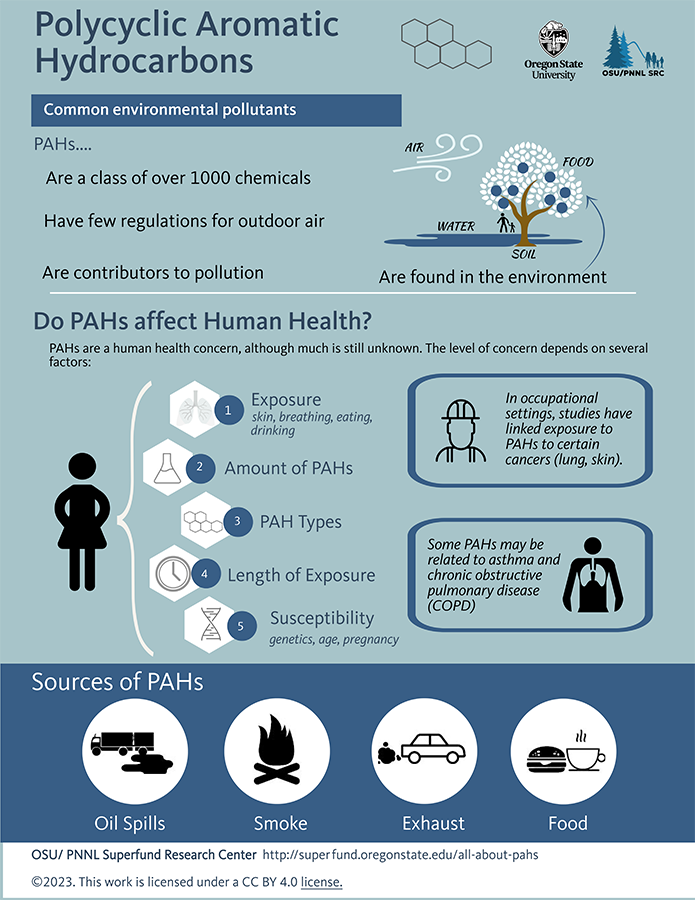
Infographic describing polycyclic aromatic hydrocarbons (PAHs): where they are in the environment, impacts on human health, and sources of PAHs.
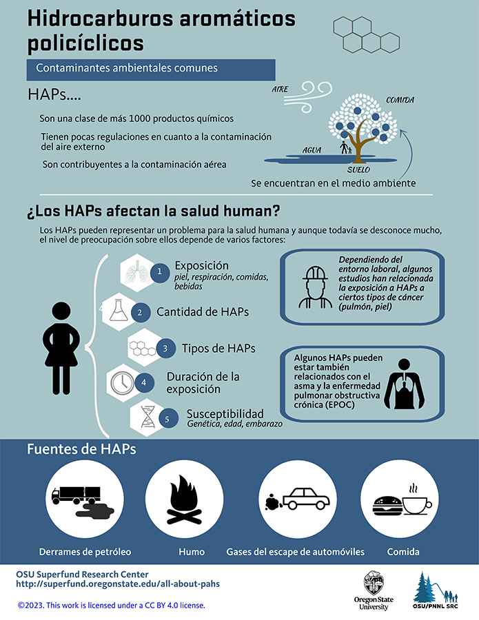
Una infografía de una página sobre los hidrocarburos aromáticos policíclicos: dónde se encuentran en el medio ambiente, efectos sobre la salud y fuentes, en español.
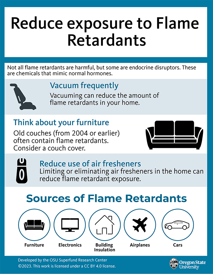
Infographic sharing three ways to reduce exposure to flame retardants and common sources of flame retardants.
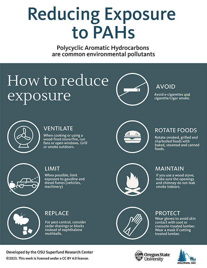
Infographic highlighting simple ways to reduce exposure to Polycyclic Aromatic Hydrocarbons (PAHs) in the environment.
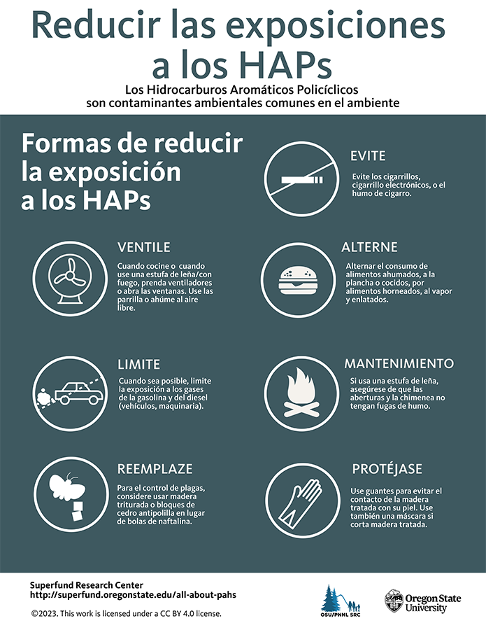
Infografía que destaca formas sencillas de reducir la exposición a los hidrocarburos aromáticos policíclicos (HAP) en el medio ambiente.
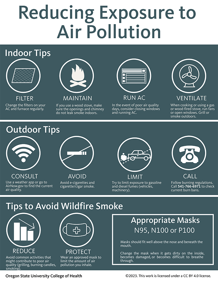
Infographic sharing information for improving indoor and outdoor air, with tips specific to wildfire smoke.
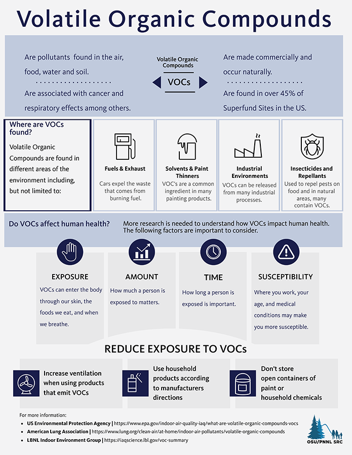
Infographic with information on Volatile Organic Compounds (VOCs) including sources in the environment, impacts on human health, and ways to reduce exposure.
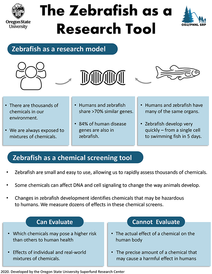
Infographic detailing the use of zebrafish as a research tool for chemical screening including what it can and cannot evaluate.
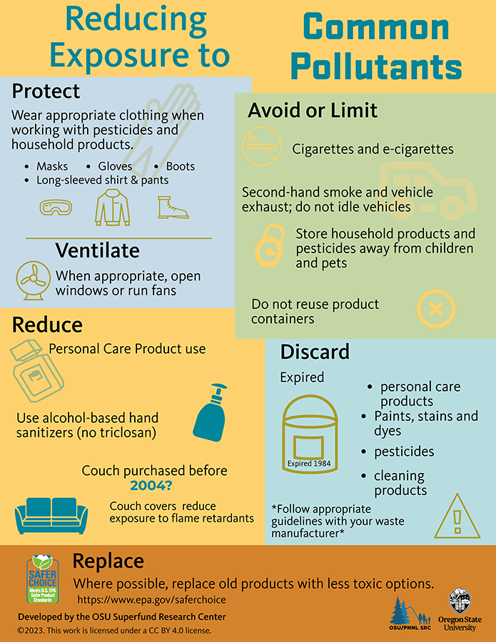
Infographic with examples of ways to reduce exposure to common pollutants such a how to protect and avoid/limit, items to discard and links to info on replacing products with less toxic options.

Community friendly infographic about how passive samplers are used to measure chemicals in the environment. Includes examples of Air, Water, and Sediment-Pore Water samplers and links to videos demonstrating how they work.

Infographic describing exposure biology and the challenges of measuring the health impact from a person's day to day exposures (e.g., metals, exhaust, smoke, tobacco).
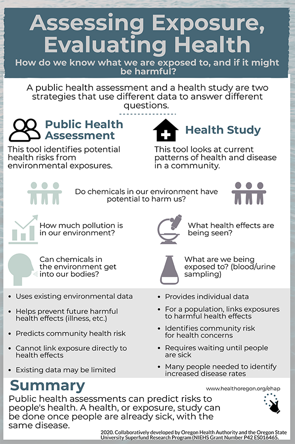
Infographic developed in collaboration with the Oregon Health Authority to characterize public health assessments and health studies.
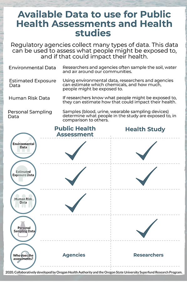
Fact sheet describing what data is collected and used by regulatory agencies. Developed in collaboration with the Oregon Health Authority.
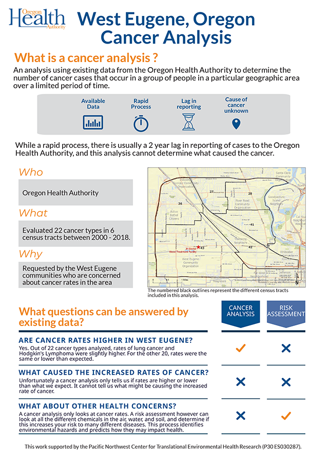
Infographic detailing a cancer analysis conducted near the JH Baxter wood processing facility in W.Eugene, Oregon and how the data can be used to address community concerns.
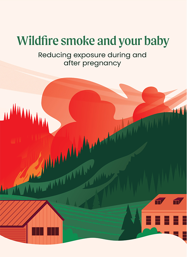
Long format educational infographic aimed at pregnant individuals. Includes information about why it's important to reduce wildfire smoke exposure, how to learn more about wildfire smoke and air quality during a fire, how to reduce smoke exposure, how to create a clean room, and other resources.
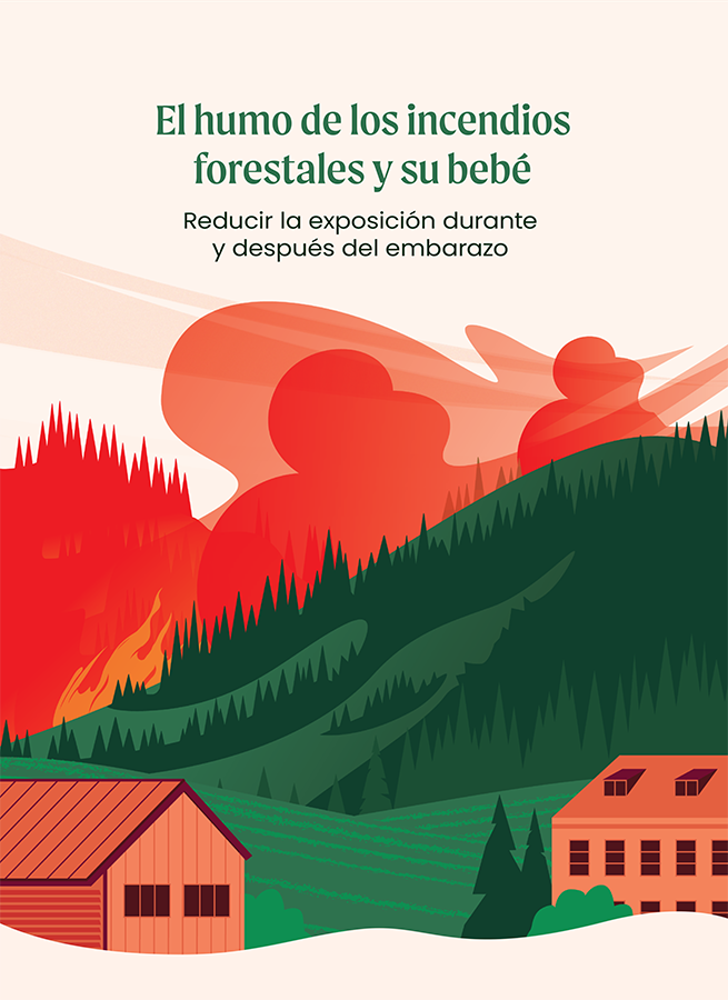
Infografía educativa en formato largo dirigida a personas embarazadas. Incluye información sobre por qué es importante reducir la exposición al humo de los incendios forestales, cómo aprender más sobre el humo de los incendios forestales y la calidad del aire durante un incendio, cómo reducir la exposición al humo, cómo crear una sala limpia y otros recursos.
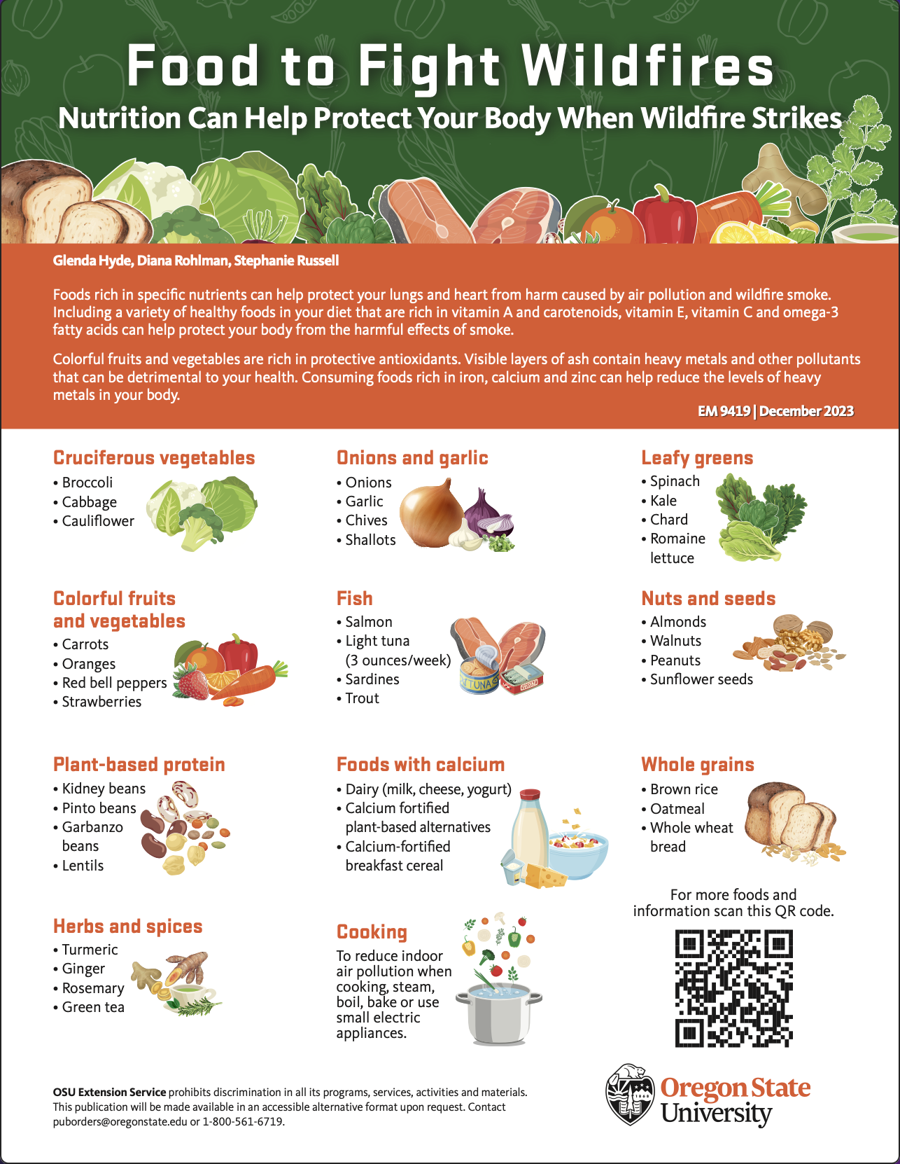
Food to Fight Wildfires
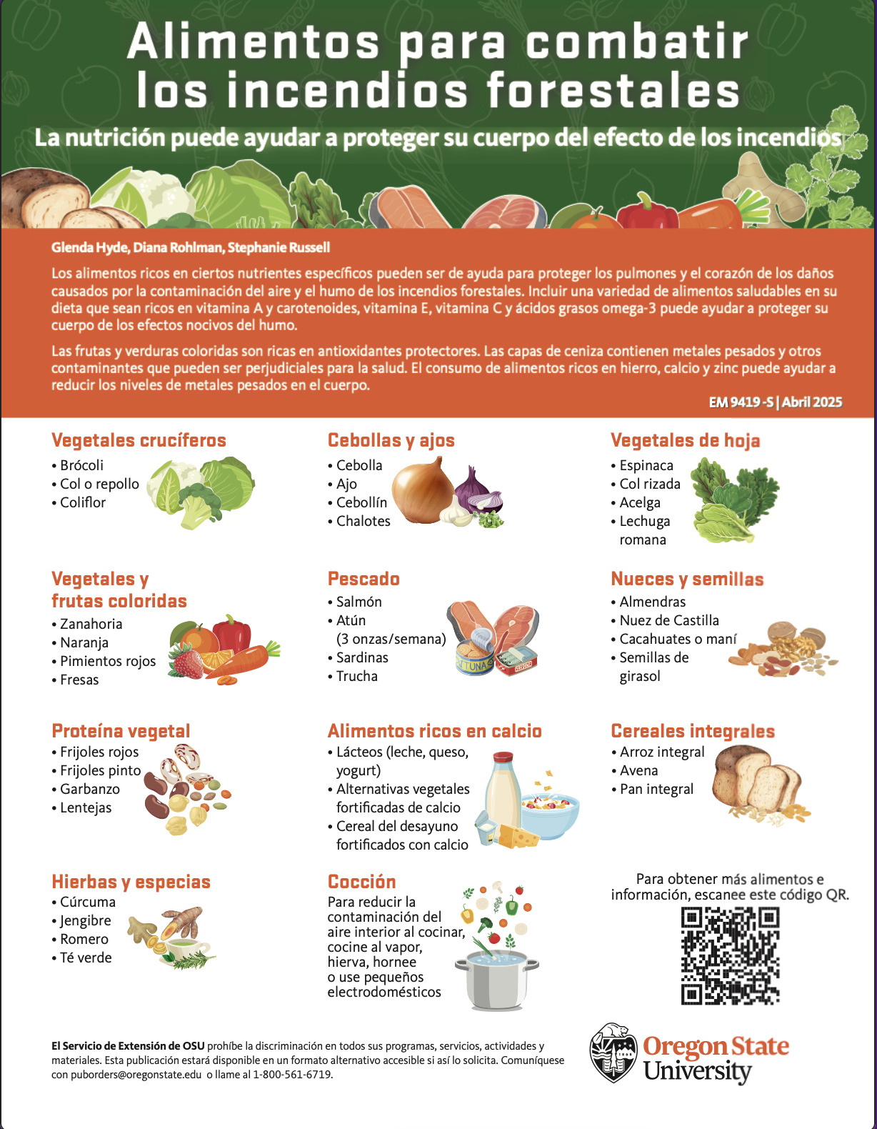
La nutrición puede ayudar a proteger su cuerpo del efecto de los incendios
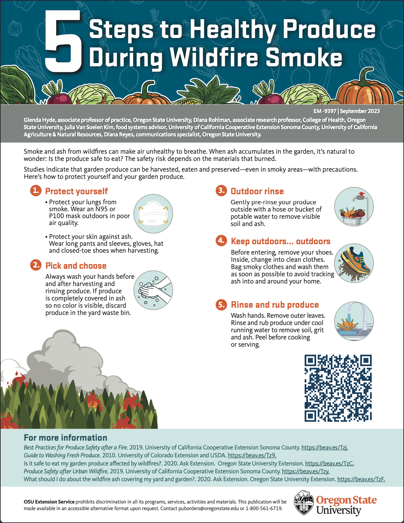
Smoke and ash from wildfires can make air unhealthy to breathe. When ash accumulates in the garden, it’s natural to wonder: Is the produce safe to eat? The safety risk depends on the materials that burned.
El humo y las cenizas de los incendios forestales pueden hacer que el aire sea dañino para respirar. Cuando la ceniza se acumula en el jardín, es natural preguntarse: ¿es seguro consumir los productos? El nivel de riesgo depende de los materiales que se hayan quemado.
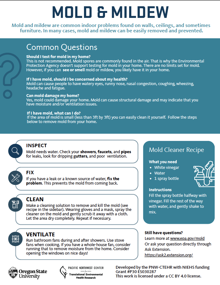
Infographic discussing what mold and mildew are, the health concerns associated with them, and how to mitigate them in the home.
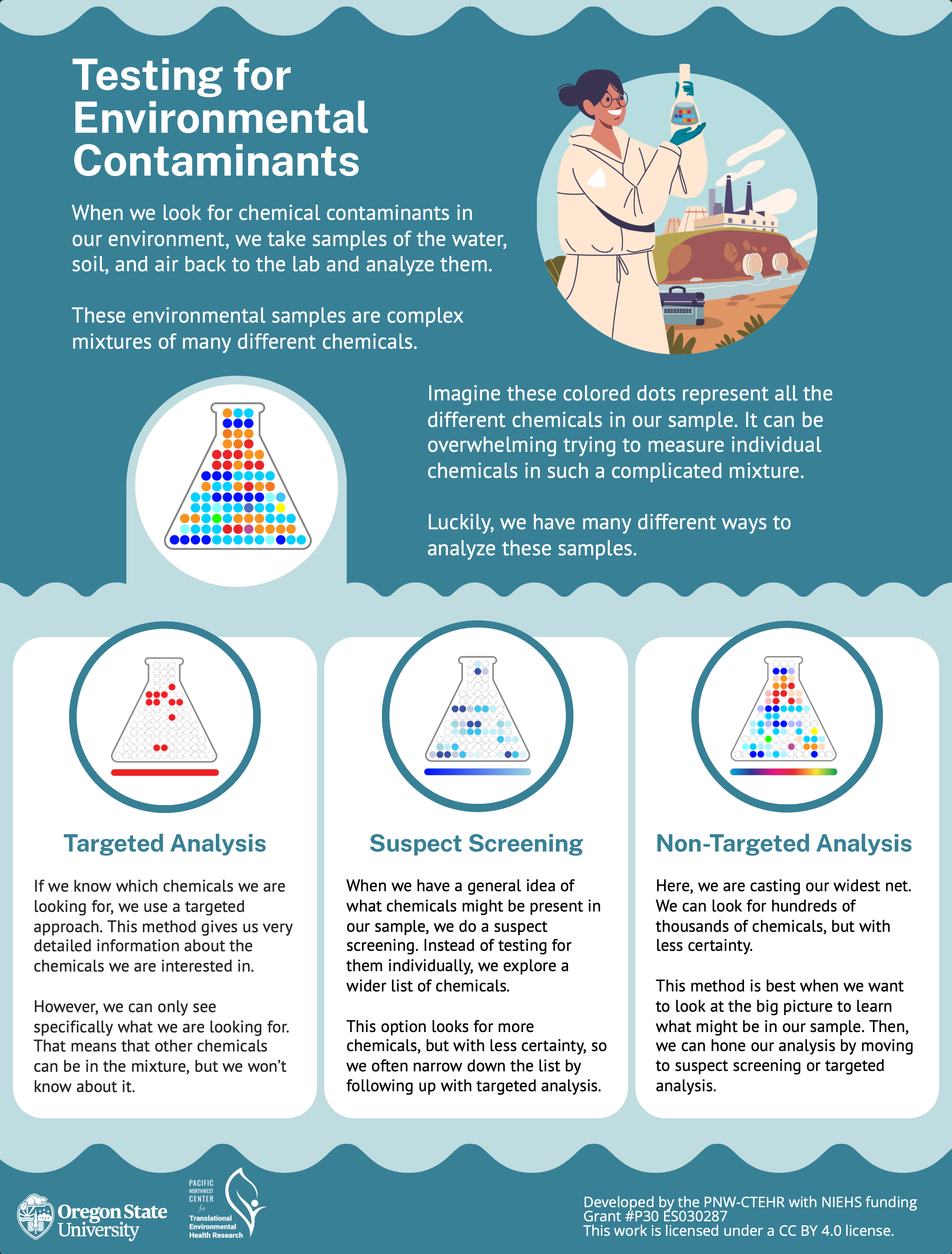
This infographic explains different methods used to test environmental samples, and what kind of information each of them gives us.
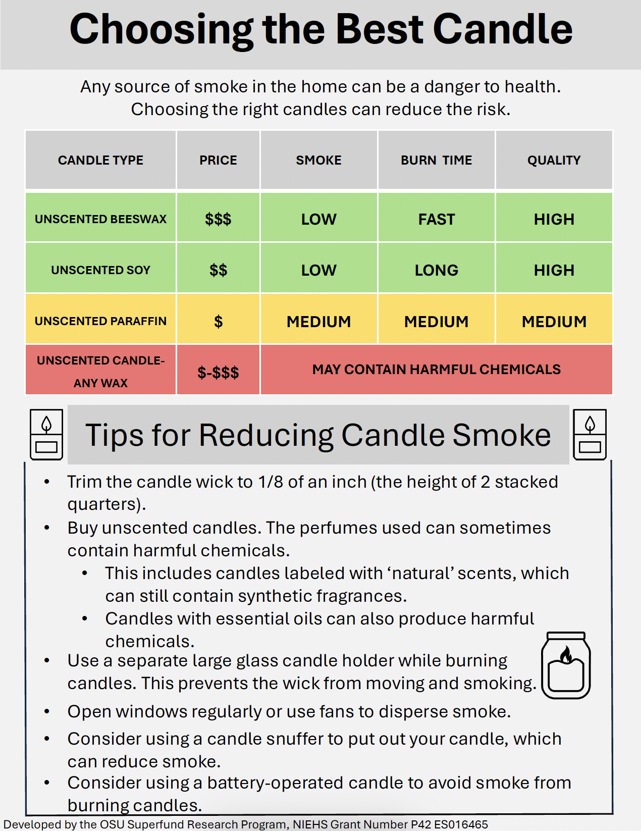
Any source of smoke in the home can be a danger to health. Choosing the right candles can reduce the risk.
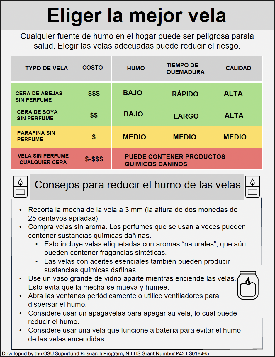
Cualquier fuente de humo en el hogar puede ser peligrosa parala salud. Elegir las velas adecuadas puede reducir el riesgo.
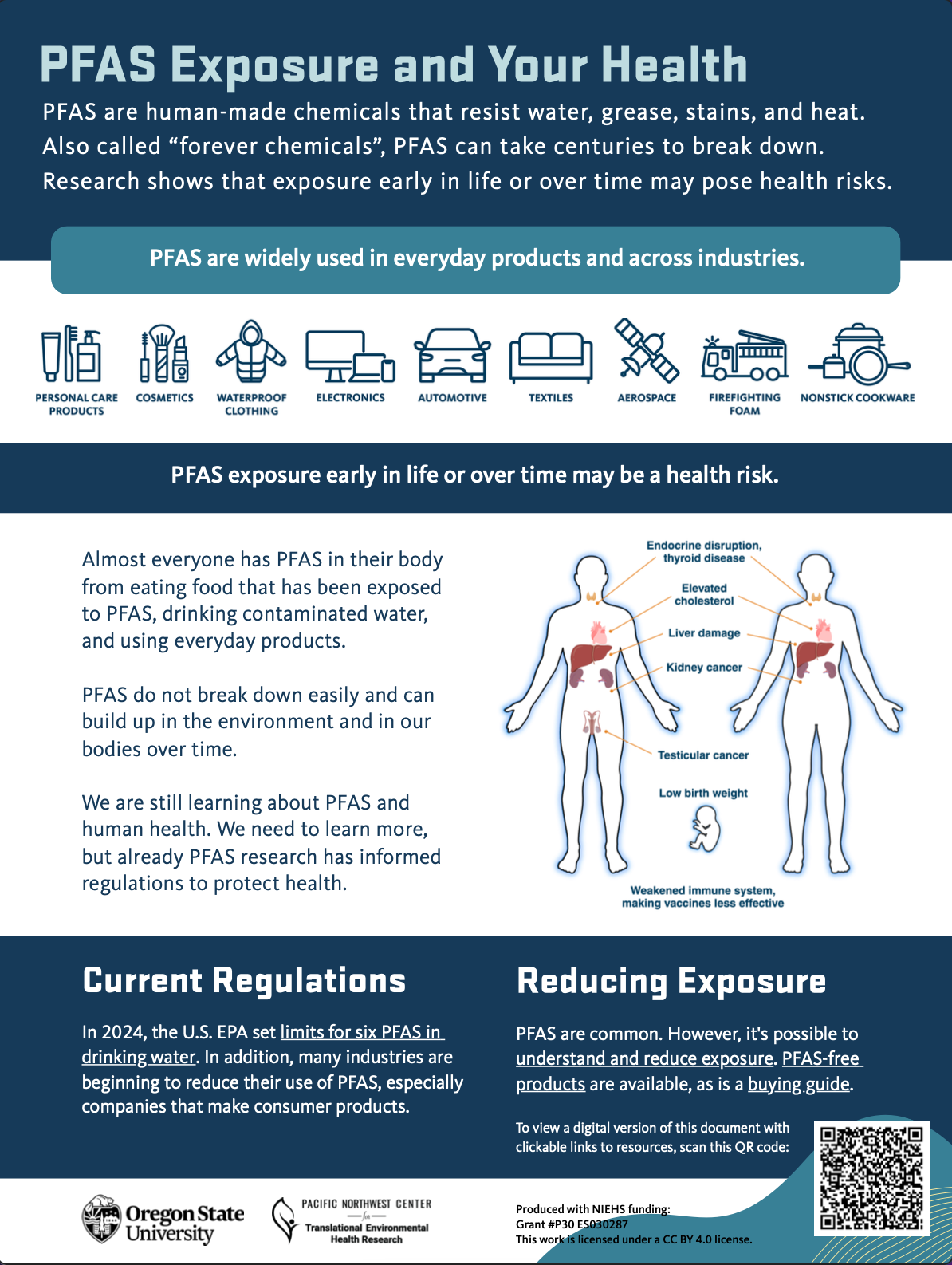
This infographic gives an introduction to what PFAS are, known exposure and health risks, and provides links to current regulations and resources for reducing exposure.
The Community Engagement Core uses infographics as one way to translate and disseminate research. An infographic is a visual representation of information, data or knowledge, relying on images and graphics to convey the main messages, rather than words. Our infographics are developed in collaboration with community groups, public health officials, regulatory agencies and other researchers. There are several free software packages that can help design infographics, and freely available icons that are appropriate for infographics.
The CEC strives to develop accessible infographics that promote environmental health literacy and follow the WCAG and PDF/UA guidelines. This involves using plain language wherever possible and assessing for reading level. We incorporate features such as proper document structure, alternative text for images, color contrast and navigational elements to ensure compatibility with screen readers and other assistive technologies to enhance accessibility for users with disabilities. We began this accessibility initiative in 2023. As a result, older infographics were not always able to be modified. In those cases, we have kept these infographics in their current form.
Relevance
Infographics are designed to distill research concepts down into 3 main messages, using graphics to convey the information. Infographics are developed for a general audience, with the ultimate goal of increasing awareness and increasing knowledge.
Design
A concept is first developed with the three main messages, a color scheme and potential graphics that support the messaging.
The infographic is designed following the guidelines of the CDC Clear Communication Index, and evaluated by community advisors.
Use
Our infographics have been:- Used by community members living near Superfund sites.
- Developed in coordination with regulatory agencies.
- Used in academic presentations.
- Provided as supplementary material in individual reports and study materials.